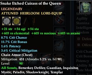

Today game update 60 was implemented, and with it a lot of pretty neat things. I do, however, have one major concern. Pictured above is what I see when I mouse over a piece of gear, and those two icons you see under the “attuned heirloom lore-equip” text are the new graphic they’ve added for adornments. Adornments are slots that you can use to add extra stats to your gear and they come in a few types including white, yellow, and red. White is a basic adornment, they’re player crafted and pretty simple and cost effective. Yellow adornments are vendor sold, they’re of a ‘legendary’ quality. Red adornments are fabled and typically come from raids although there other ways of obtaining them. My problem is the fact that when you looked at a piece of gear you could instantly tell what type of adornment your gear took based on the fact that there were words that told you [yellow adornment slot] and the like. Now they’ve switched to this weird graphic that is incredibly unfriendly to colour-blind players. I can see colours just fine and even I have issues telling that those two slots are white (it looks like grey) and yellow (looks more like tan).

Note the actual adornment itself (pictured above) – it says “slot type: white adornment slot” – that is perfect. It doesn’t matter what colour any of the text is, players can read right there that it’s for a white slot. I’m REALLY hoping SOE re-thinks their decision to use a colour based graphic in their armor pieces. It does nothing but create a hassle for those who may not be able to see it as well as they’d like.
I understand that it’s not an easy task to make sure that your game is accessible to every person out there when everyone is different, but I really do take a lot of pride in companies that go out of their way to make sure there are options for those who need them. For example, Rift uses sounds to trigger some events – but they also use text that scrolls across your screen. Great for those who may not be able to hear. When it comes to any sort of design decision it’s really important that you think above and beyond what the ‘average’ player may want – and look into those minorities. They’ll appreciate it, trust me.
Happy gaming, no matter where you find yourself.
It also looks incredibly clunky. The graphic is either scaled too large, or doesn’t have enough resolution. Probably a bit of each (it shouldn’t take that much screen estate). It’ll take time to get used to this washed out hideousness. Also, it seems these things are everywhere now? The first quests I did last night at level 15 immediately rewarded low-level adornments to use – I’m pretty sure that’s new.
Yeah, I see gray and beige up top too. Silly SOE “fixing” what wasn’t broken.